Showing posts with label creme. Show all posts

Wednesday, February 25, 2009

Shades by Barielle Summer 2009 Sugar Rush Collection

Eek! I am so excited about the new Shades by Barielle Sugar Rush collection for Summer 2009! This collection is aptly named because when I look at these colors they really do make me think of candy. The new Sugar Rush Collection has six pretty candy colored hues to satisfy your mani-pedi cravings with on-trend, fashionable nail color. I am so glad to see that companies like Barielle are taking risks and releasing fun and bright colors like this! This collection will definitely satisfy non-traditional polish consumers. 

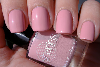
Shades by Barielle Cotton Candy:


Barielle Cotton Candy is a medium toned pink with a subtle magenta shimmer. This color really reminds me of Zoya Barbie. This is the only one in the bunch that needed three coats. 

Shades by Barielle Swizzle Stix:


Barielle Swizzle Stix is hands down my favorite in this collection. It is a robin's egg blue that is slightly more vibrant than the real thing. I love love love this color!

Shades by Barielle Grape Escape:


Barielle Grape Escape is a gorgeous purple creme. I don't have many purple cremes so this is a welcome addition to my stash. Grape Escape reminds me of Sally Hansen Night Hydrangea (Spring 2009) minus the shimmer. Purple shades that actually look purple in all lights are hard to come by, so this is a must for you purple lovers. 

Shades by Barielle Lemondrops:


Barielle Lemondrops is a vibrant yellow creme. There is nothing muted about it but it really isn't neon either. This color looks so good, I want to eat it! That is because it reminds me of my favorite candy - yellow Sprees! The only thing this manicure is missing is some smiley faces a la Rihanna style. 

Shades by Barielle Sweet Addiction:


Barielle Sweet Addiction is a minty green creme that reminds me of chewing gum. Another fabulous color!

Shades by Barielle Decadence:


Barielle Decadence is a shimmery blue/green/turquoise color. This color is so gorgeous! It really glows.

Application of all colors in this collection was fabulous. Some of them were a little on the thick side but none were problematic. All of the colors were extremely pigmented. The only one that I thought could have used three coats was Cotton Candy. The others were totally opaque with two coats. Most were opaque on even the first coat. Again, I applaud Barielle for this fabulous collection! Each color is unique and wonderful. 

The Shades by Barielle Sugar Rush collection for Summer 2009 is available now at Barielle.com. The nail polishes retail for $8.00 each. But right now they are offering free shipping for orders over $50 and if you buy 2 colors you get the 3rd one free! I'd buy these soon because I don't know how long the promo will last. 
Wednesday, February 11, 2009

Tracy Reese for Sally Hansen Spring 2009

It's that time again! Time for another fabulous collaboration between designer Tracy Reese and Sally Hansen. These nail polishes in the Tracy Reese for Sally Hansen Spring 2009 collection are so hot! I love each and every one of them. They are super pigmented and a joy to apply. Enough babble, on to the swatches!

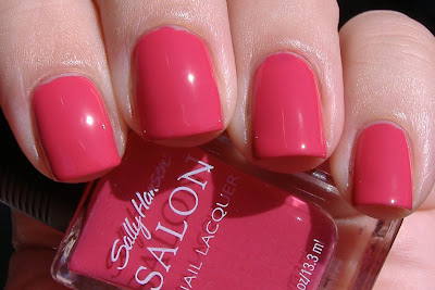
Sally Hansen Azalea:

sally hansen azalea salon nail polish

Azalea is a gorgeous pink creme. This swatch is two coats. For me, this is definitely a fabulous summer pedicure color.

Sally Hansen Forsythia:

sally hansen forsythia nail polish

Forsythia is a yellow shimmer. This is so pretty! There is something very oddball about this color but I am so in love with it. It reminds me of lemons. This is one of those colors that I want to eat! I don't know how well this color suits my skin tone, but it is so cool that I don't care. I will totally wear this all summer long!

Sally Hansen Nasturtium:

sally hansen salon nasturtium nail polish

Nasturtium is a fabulous orange creme. I have heard this color called coral. I don't think there is anything coral about it personally. It is orange. I don't really think this color suits me but I still think it is really pretty. I'll also say that most oranges are a streaky hot mess to apply but this one applied perfectly, like butter.

Sally Hansen Honeydew:

sally hansen honeydew nail polish

Honeydew is a green/teal shimmer. It is nice to finally see that nail polish companies are recognizing the need for some funkier colors in their seasonal collections. I personally love to wear anything blue or green. So this is right up my alley! This color is 100 times prettier in person than in this picture.

Sally Hansen Night Hydrangea:

sally hansen night hydrangea

Night Hydrangea is another color that is 100 times prettier in person. This is the perfect purple shimmer. I don't mind blackened shades. I actually quite like them. But sometimes you just want a purple that looks purple. This is it! The purple that looks purple in all lighting situations.

Sally Hansen Tassel:

sally hansen salon tassel nail polish

Tassel is a metallic gold. This was the only one of the bunch that required three coats. I love that Tracy threw a metallic in the mix for spring. It is fun and unexpected!

There is one more color in this collection - Beet Stain. I have no idea where it is... It's very similar to OPI Miami Beet and Zoya Moxie.

Did you guys notice my short nails in these pictures? I broke the corner off of my index finger so they got filed down. In the winter it is so hard to keep them in good shape! The air is just so dry. Oh well, they have been growing like weeds lately.

Back to the nail polish banter now. Like I said, application on all of these colors was superb. Tassel was the only three coater of the bunch. The others were perfectly opaque with two coats. My only complaint, if you can even call it that, is about the brushes. There is nothing wrong with them per se, but they are a bit long in my opinion. It is really just a matter of my personal preference. My preference is for a shorter brush. I just find it easier to control the polish with a shorter brush. Other than that, these babies are perfect!

The Tracy Reese for Sally Hansen Spring 2009 collection is set to hit stores late February/early March. Distribution of these special collections is notoriously bad; so keep your eyes WIDE OPEN for them and snatch them up as soon as you see them! They'll be gone before you know it.

Tuesday, February 10, 2009

More from BB Couture for Nails

Today I have more from BB Couture for Nails to share with you. I have one brand new shade, one that is new to me, two that you've seen here before but I tried to get better pictures of and a few old favorites.

First, the brand new shade, BB Couture for Nails Midnight Desire:

bb couture for nails midnight desire
Super dark blue/purple shimmer. This is one of those shades that looks nearly black indoors but then outdoors it is super gorgeous. At first I thought this might be dupeish to Chanel Vendetta but it is not. This is more noticeably blue than Vendetta, which is way more purple. I would have done a comparison swatch if I thought it was warranted, but it isn't. I am wearing Midnight Desire right now and I absolutely love it! I never get tired of shades like this. Midnight desire is extremely opaque with one coat but I used two for good measure.

Next, the shade that is new to me, BB Couture for Nails Dragon's Breath:

bb couture for nails dragons breath

Purple/plum jelly with glitter. LOVE this color! This swatch is three coats. I love jelly based glitters like this because they have amazing depth. I love how the glitter looks almost like it is trapped deep under the layers of polish, almost like it is suspended in jello or something. Am I making sense at all?

Finally, the shades you have seen here before but that I tried to get better pictures of.

BB Couture for Nails Sea of Cortez:

bb couture for nails sea of cortez

BB Couture for Nails Frosty Meadow:

bb couture for nails frosty meadow

I tried to get better pictures of these jelly based stunners. Hopefully it worked! For you girls out there that appreciate the funkier colors, both of these are *must* haves. I think these blue an green shades are absolutely perfect. Just stunning.

Since we are on the subject of BB Couture for Nails, I thought I'd also show you a few of my old favorites.

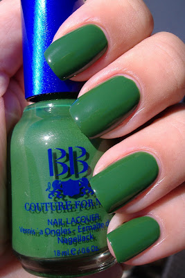
BB Couture for Nails Poison Ivy:

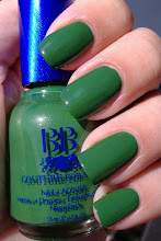
bb couture for nails poison ivy

BB Couture for Nails Maleficent Magenta:


BB Couture for Nails nail polishes can be purchased at Overall Beauty. Also, if there are any shades that you see on my blog but that you can't find at Overall Beauty, you can also contact BB Couture for Nails directly via phone or email (info on their website) and they will sell them to you directly.

Monday, February 9, 2009

Orly Prepster Collection for Spring 2009

This Spring Orly introduces the Prepster Collection, a range of six new shades that put a fashion forward twist on traditional style with modern shades of pink, lavender and khaki brown. Today I have three nail polishes from the collection to share with you. But before I do that, I have to let you in on a little secret about me. I love anything and everything preppy! You might not have guessed that with all of the crazy nail polish that I like to wear. But I love me some Lilly Pulitzer, Kate Spade, Stephen Bonanno, J. Crew, and Vineyard Vines. So it is no surprise that I am all over the newest collection from Orly! Now on to the swatches.

Orly Tennis Anyone?:

orly tennis anyone

Off white, nude creme. Even though this was a three coater, it is a great shade because it is an easier and more flattering way to wear a white polish. This shade is warm and not stark like so many other whites in my collection. Winner! Plus I love to play tennis, so just the name is enough for me.

Orly Polo Princess:

orly polo princess

Bright pastel pink creme. I found the application on this one to be a bit troublesome due to the streakiness factor but I like the color enough to make up for it. This is a three to four coater. This is one of those colors that looks good enough to eat. Do you know what I mean? It reminds me of ice cream.

Orly Cashmere Cardigan:

orly cashmere cardigan

Iris blue creme. Loving the name on this one too! The color is fabulous, the picture speaks for itself. 

The other colors in the Orly Prepster collection sound fabulous too:

Prim & Proper - lavender shimmer
OMG - fuchsia pink creme
Country Club Khaki - taupe creme

I wish I had them to share with you but sadly I don't. 

Even though one of these colors was a bit of a pain, overall I am always impressed with nail polishes from Orly. Application is usually top notch. I also love the rubberized gripper cap. Guess who else has a rubberized cap? SpaRitual! Coincidence? I think not. Did you guys know that Orly and SpaRitual are made by the same company? I just figured that one out. No wonder I like Orly.

The Orly Prepster collection is not slated to hit stores until April but I am already hearing stories of these popping up early in beauty supply stores, so keep your eyes open. Plus the etailers have also been known to get collections in early. So hopefully you'll be able to find these soon!

Strengthen your nails with Tamanu Oil. Take a look at Makeup Kits. Available online for all types of
Skin Tones.

Tuesday, February 3, 2009

SpaRitual Cherish Spring 2009 Color Collection

The new SpaRitual collection for Spring 2009, Cherish, features six shades that range from princess pink to baby blue. I have swatches of two of them to show to you today.

SpaRitual Marvel:

sparitual marvel
Lavender pink shimmer. Gorgeous color, fabulous application. I used three coats but you could really get away with two coats just fine. I love this color and look forward to wearing it often. 

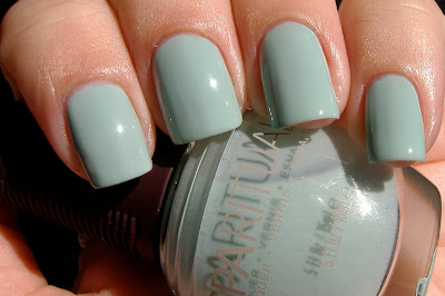
SpaRitual Delight:

sparitual delight
Stunning aqua blue creme. Before you ask, this is not a dupe for China Glaze For Audrey. Delight is a shade or two lighter than For Audrey. 

Oh Delight, you are a delight to look at but not a delight to apply. You see, this swatch isn't three coats of color, it's not even four coats. This swatch is a whopping FIVE , albeit thin, coats of nail polish. This color was just too streaky to look even with less than five coats. I have never encountered a five coater before, this is the first. I am shocked because I have never met a SpaRitual that I didn't like; usually their application is flawless. I don't know if it had something to do with my base coat or if somehow I got a dud of a bottle. Admittedly, I do not own SpaRitual's base coat. But I swatched this over my regular base coat and also a ridge filler. Neither was better than the other. I don't know if using SpaRitual's base coat might have improved the application of this color. I can only hope it would. Sigh... this is still such a pretty color. I don't know if I'll ever have the patience to actually do a manicure wearing it.

There are four other colors in SpaRitual's Cherish Spring 2009 color collection:

SpaRitual Love - bright pink creme
SpaRitual Adore - light pink shimmer
SpaRitual Treasure - bright orange shimmer
SpaRitual Revere - orange and gold shimmer 

I have not seen swatches or even bottle pictures yet of the other four colors but I am very curious to see Revere and Treasure. 

SpaRitual nail lacquers are available in fine salons and spas and online at skinstore.com
These new colors should be available any day now. 


Wednesday, January 28, 2009

Shades by Barielle Sun Goddess Collection for Spring 2009

For Spring 2009 Shades by Barielle is offering six new light and feminine colors. These colors definitely fall into the realm of work appropriate colors and there is nothing wrong with that. They are very wearable and very chic. I am in the process of looking for a job right now, so I am making mental notes of all of the pinks, sheers, and such that I like so that when I am working I have options. Do any of you out there have to wear "work appropriate" colors? Anyways, on to the swatches!

Shades by Barielle Nauti-Gal:

Sheer taupe with small silver glitter.  Three coats. This is kind of an unusual color but at the same time it is very work appropriate. I would definitely wear this color.

Shades by Barielle Beaches & Dreams:

Peach creme. Two coats. Perfect opacity, no need for a third coat. Love this color! It looks very fresh. It is similar to wearing white in the same way that a white creme is bright. I think this would make a great pedicure color too. This is my favorite color in the collection.

Shades by Barielle Shell Shock:
barielle shell shock
Sheer berry pink. Three coats. I am strangely drawn to this color. It's just a sheer pink but it has a nice bright quality to it. Love this too! This is my second favorite.

Shades by Barielle Sailors Delight:
barielle sailors delight
Mauve pink creme. Two coats. When I saw this in the bottle I did not think much of it but I like it on. Another very pretty and fresh color! 

Shades by Barielle Skinny Dip:
barielle skinny dip
Sheer peach. Three coats. This one really did not do anything for me. There is nothing wrong with it, just not for me. 

Shades by Barielle Sand-al Chic:
Sheer pink peach. Three coats. This is very natural looking, not a typical choice for me but I'd definitely wear it to work or any other time I am going for a more subdued look. One great thing about sheer, natural colors like this is that they do not show tip wear and tiny chips like other colors do. Right now, I change my nail color almost daily. But if I was working I would not have the time, energy or patience to do so. If I was working, I'd rely on colors like this to get me through the week without having to do a polish change.

I liked the application of the sheers - they were not as streaky as most sheers. The cremes were all two coaters and the sheers were three coaters. No application issues in the bunch. Shades by Barielle nail polishes are big three free - no formaldehyde, no DBP and no toluene.

The Shades by Barielle Sun Goddess Collection for Spring 2009 is available now online at Barielle. Shades by Barielle can also be found in CVS stores, but I don't know if the new colors are in-store yet. 

Barielle is having a fabulous promotion on their website right now: buy 2 nail colors, get 1 free! There is no telling how long this promo will last, so if you see something you like, snatch it up now!


Saturday, January 17, 2009

Reader Requests: Comparison Swatches Part 2

Happy Saturday!

I have more comparison swatches for you today. If you don't see your request here, do not worry, I still have more in the works.

First, OPI Miami Beet (pinky and middle fingers) and Zoya Moxie (ring and index fingers):

It was so sunny yesterday that photographing these colors was nearly impossible outside. The bright sun was really distorting the colors for me. So this pic was taken in my laundry room where I get really nice natural light from the huge window. As you can see, these two colors are extremely similar. OPI Miami Beet has a brighter appearance and Zoya Moxie is slightly dusty or muted. Both are great colors! Do you need both? That is your choice.

Essie Eternal Optimist (pinky and middle fingers) and OPI Tickle My France-Y (ring and index fingers):

Two totally different colors. The only thing they have in common is that they are nudeish shades with a creme finish. I personally prefer Tickle My France-Y but I also like Eternal Optimist and will definitely wear it. But if you already have Tickle My France-Y, and were wondering if it was a dupe for Eternal Optimist so that you did not have to buy it, well clearly it is not a dupe. Sorry ;) 

Sorry that I only have two comparisons for you today! Our weather here in the greater San Diego area has been freaking amazing for the last week or so. We have been having high temps in the low to mid 80's and it has been super sunny. When we get a streak of weather like this in January, as much as I like playing with my nail polish, I just can't bring myself to sit in the house and swatch. Our 2nd floor deck overlooks a lagoon and the ocean, and I just love to sit out there and catch some rays. My cats Cleo and Vincent usually join me outside and sit under the chairs for some shade. As I have mentioned before, we moved to California from Michigan back in July. I am not used to living in such a beautiful climate, especially in the dead of winter!

I'll have more comparison swatches soon in the next few days. Feel free to comment or email me if you have any special requests! I will also have more spring 2009 new releases to share with you.

Hope that all of you have a fab weekend and if you are in the mid-west or somewhere else chilly, stay warm! I know my fam back in MI has been getting some ugly weather. Junk.

xoxo,
Katee

Thursday, January 15, 2009

Reader Requests: Comparison Swatches Part 1

Hi everyone!

Hope you all are having a wonderful day so far. My recent posting of spring collections from Zoya, Essie and OPI inspired many of you to write me and request comparison swatches. I am happy to oblige! If you do not see the swatches posted that you requested, do not fret. I will be bringing you more comparison swatches in the next week or so. As always, feel free to e-mail me (nailpolishfan@gmail.com) anytime or just leave a comment if you would like to see a comparison swatch. If I have it, I'll swatch it! If I don't, I'll let you know.

First up, we have OPI Feelin' Hot Hot Hot! and OPI Party In My Cabana, both from their new South Beach collection:

OPI Feelin' Hot Hot Hot! is on my pinky and middle fingers. OPI Party In My Cabana is on my ring and index fingers. As you can see, Feelin' Hot Hot Hot! is a bit lighter and brighter than OPI Party In My Cabana. PIMC is slightly darker and dustier than FHHH (excuse my abbreviations, I get tired of typing the long names over and over again). I prefer OPI Feelin' Hot Hot Hot! out of the two, but if you love pinks, of course they are different enough to justify purchasing both.

Next, we have China Glaze Pink Underground from the fall 2008 Operation Colour collection and Zoya Barbie from their latest collection, Twist:

China Glaze Pink Underground is on my middle and pinky fingers. Zoya Barbie is on my ring and index fingers. Both Pink Underground and Barbie are pinks with a similar magenta shimmer, only Pink Underground is darker. Personally, I prefer China Glaze Pink Underground. But again, if you love your pinks, go ahead and get Zoya Barbie even if you already have China Glaze Pink Underground.

Moving right along to Zoya Harley (spring 2009 Twist collection) and Sephora by OPI Run With It!:

Zoya Harley is on my pinky and middle fingers. Sephora by OPI Run With It! is on my ring and index fingers. Clearly you can see the difference between these too, Harley is a cool toned grey shimmer and RWI has a golden look to it. Funny, before swatching these two side by side, I always knew that RWI was a warmer grey, but I never thought of it as golden. I don't think I will ever think of Run With It as grey again.

Finally, Zoya Harley and OPI "Sheer" Your Toys!:

Zoya Harley is on my pinky and middle fingers. OPI "Sheer" Your Toys! is on my ring and middle fingers. Wow! I never thought that these two would look so similar! You can see that SYT has a bit of a more blue or steel tone to it. Both nail polishes have similar copper flecks, but the ones in Harley are finer and more of a shimmer. The copper flecks in "Sheer" Your Toys are larger, chunkier, and more noticeable. Click the picture to enlarge it so you can see what I am talking about. Again though, I am very surprised at how similar the two of these are. If you are on a low/no buy right now, I really don't think you need both of these. But if you are a grey lover, you'll probably still want both.

That wraps up this round of comparison swatches. I'll have more coming soon! 

Also, just wanted to remind all of you about my random giveaways. I am cleaning out my stash of nail polishe, the unopened ones, and you guys are going to benefit from it! Every now and then, when I am in a random mood, I am going to randomly pick an e-mail subscriber to win the unopened nail polish of my choice. If you are not an e-mail subscriber yet, you should definitely sign up. Just enter your e-mail address in the box below to subscribe.

Enter your email address:

Delivered by FeedBurner


Ok, gotta run... talk to you all later! (it's 75 and sunny outside)

xoxo,
Katee

Tuesday, January 13, 2009

Essie Spring 2009 Collection Swatches

Hi everyone!

Today I have swatches of Essie's Spring 2009 collection for you. First the swatches and then my overall thoughts on this terrific collection. All swatches here are three coats of color, no topcoat. As always, you can click on the pictures to enlarge them if you like.

Essie Lacquered Up:
essie lacquered up
Red Hot Crimson. This reminds me of a juicy, ripe tomato!

Essie Flawless:
essie flawless
Cherry Blossom Pink. Nice opaque pink for those of you that do not like sheer ones. I think this is a very pretty work appropriate type color.

Essie Eternal Optimist:
essie eternal optimist
Spiced tea rose. Nice opaque beige-y nude. Another very nice work appropriate color. This is a color I will definitely reach for when I am in one of my nude color moods, which are happening surprisingly often lately.

Essie Mesmerize:
essie mesmerize
Roa va-va blue. Whoa Essie! This one is straight out of left field! Huge surprise, in a good way.

Essie One of A Kind:
essie one of a kind
Poppy red kiss. Fabulous pedicure color! I love this red hot coral. Nice and bright.

Essie Status Symbol:
essie status symbol
Feisty hot pink. It certainly is feisty! Nice hot pink (not neon) that would also make a lovely pedicure color. I am not huge on pinks but I am really digging this one.

Application on all of these was just fine. I used three coats of nail polish on all of these swatches but to be honest with you, the only one that really needed three coats was Lacquered Up. The rest of them were opaque enough to be fine with two coats.

I am seriously shocked, in a good way, by Mesmerize. This color is so hot! It is mesmerizing, no lie. I have been looking for a fabulous blue creme, one that is not blackened, and this definitely fits the bill. 

As far as the other colors, I can live without Lacquered Up, but I am really digging the rest of them! I think that Essie does the soft colors better than anyone else. Flawless and Eternal Optimist are great soft, work appropriate colors. One of A Kind and Status Symbol are great bright colors. With the exception of Lacquered Up, I would absolutely wear all of these colors in real life. I am actually really excited to get a pedicure with Status Symbol!

I think this collection has a nice variety and something for everyone. Two thumbs up from me for Essie on this collection! What do you all think?

Essie's spring collection will be available starting in February at www.essie.com as well as beauty stores nationwide. 

That is all for now. I will be back soon with some reader requested comparison swatches and of course, more spring collections!

xoxo,
Katee


Friday, January 9, 2009

OPI South Beach Collection Spring/Summer 2009 - Swatches Part 2

Hello, dear readers!

Today I am bringing you part two of my OPI South Beach Collection swatches for Spring/Summer 2009. The more I use and play with these nail polishes, the more I love them!

OPI Done Out In Deco:

Gorgeous lilac creme. Need I say more? Ok, I will. This color is fabulous.

Paint My Moji-Toes Red:

Rosy red creme. Not my thing, but there is nothing wrong with this color either. This is one of those colors that falls into the category of something that my mom, sister and best friend would love. 

OPI Clubbing Til Sunrise:

Frosty orange with golden shimmer. I think Clubbing Til Sunrise is the prefect name for this color because when I was swatching it, I definitely thought of the sun. If I have not said this before, I'll say it now - how the heck does OPI come up with these names? I love them! OPI always comes up with the most clever and witty names for their nail polishes. I don't know how they do it.

OPI Suzi & The Lifeguard:

Cool pink shimmer. This is a very girly color! A great opaque pink for those of you that do not like sheer pinks. My sun stopped cooperating during the swatching, so for now, this is not the best swatch of this shade. I will update later when the sun comes out again. 

*edited* The sun came out and so here is an entirely better picture of Suzi & The Lifeguard:

OPI Miami Beet:

Dark raspberry colored creme. I absolutely LOVE this color! My picture does not do it justice. This color is really a few shades darker than this picture suggests. For some reason, colors like this always appear lighter in photographs than they really do in real life. 

OPI Conga-Line Coral:

Rosy orange shimmer. I think this is a shade that my girlfriends with darker skin will be able to rock more successfully than I. But still very pretty!

Ok, so now for my overall thoughts on this collection. I'll be the first to admit, when I saw the promo pics for this collection, I was feeling let down and underwhelmed. But now that I have had a chance to swatch all of the colors, I think this collection has something for everyone.  For lovers of pinks, purples, and summer brights, this collection does not disappoint. OPI also threw in a few colors that are different enough to satisfy those with tastes that fall outside of the mainstream. I know that some of you are disappointed with the lack of a green or blue shade, but hey, all collections can't be everything to everyone.  But seriously, the tie in for a blue color in this collection entitled South Beach would have been soooooo perfect! Either a pale art deco blue or something vivid and shimmering like the ocean. Oh well! But even me, with my tastes for "different" colors, I still found plenty (see below) that I feel are MUST HAVES. 

Katee's MUST HAVES from the OPI South Beach Collection, in no particular order:
OPI Sand In My Suit
OPI Done Out In Deco
OPI OPI On Collins Ave 
OPI Overexposed In South Beach
OPI Miami Beet
OPI Feelin' Hot-Hot-Hot!

Those are my MUST HAVES, colors that I will be rockin' this summer on both tips and toes. 

If you missed the first half of my OPI South Beach Collection swatches, make sure to check them out here. This collection hits store shelves February 4, 2009. 

OK, now that you have seen all of the swatches, I want to know what colors you are feeling! I am really curious, so let me know in the comments.

That is all for now. I hope you enjoyed the swatches.

xoxo,
Katee


Thursday, January 8, 2009

OPI South Beach Collection Spring/Summer 2009 - Swatches Part 1

Good day, dear readers! 

Today I have for you the first look (other than promo pics) at OPI's new South Beach Collection for Spring/Summer 2009. I am sharing six of the colors with you today and will share the other six colors in the coming days. The OPI South Beach Collection will be available February 4, 2009. For those of you that love pinks, corals and reds, you will *love* this collection. There are also a few oddballs in this collection, for those of us with different tastes in nail polish. Now, on to the swatches! And as always, you can click on any of the pictures to enlarge them.

OPI Party In My Cabana:

Pink creme that has a slightly muted appearance. I do not usually wear colors like this but I know that mom, sister and best friend would LOVE this one. I expect emails from at least two of them wanting to steal it from me hahaha.

OPI Bronzed To Perfection:

Caramel brown base loaded with gold shimmer that is large enough to be considered a glitter. This color was one of the surprises for me. When I saw the promo pictures of this color, I did not think I would like it. But now that I am wearing it, I know that I'll love it in the summer when I have a tan. I can also see my friends with darker skin than moi being able to successfully rock this color. I think this would look *awesome* on my friend Brittany from Clumps of Mascara. B, what do you think?

OPI Overexposed In South Beach:

Dark magenta purple with violet shimmer. I really like this color a lot! Probably one of my favorites in this collection. I will wear this on both my fingers and toes. Again, I also think this color will look better on me when I have a little more color. *edited to add* This is a distant 2nd cousin to OPI Louvre Me, Louvre Me Not, but not a dupe. LMLMN is more violet purple than Overexposed. Overexposed is more magenta toned. I would definitely suggest owning both if you like colors like this!

OPI Feelin' Hot-Hot-Hot!:

Very pretty bright pink creme. It looks much more vivid and brighter in person. This is very similar to OPI's Elephantastic Pink but is brighter and cooler than EP. Probably not a color that I would wear on my fingers but I will definitely be sporting this as pedicure as soon as it gets warmer outside. 

OPI Sand In My Suit:

Golden beige-y nude base with serious shimmer. I think this shade is just stunning! This is a great go-to nude for the spring.

OPI OPI On Collins Ave:

Bright coral orange creme. This is another HOT shade. It is bold but I think I will be brave enough to sport this on my fingers this summer. Of course, it would rock for a pedicure too, no question about that. This color is so bright, it glows!

Application on all of these was fine, just like all OPI's that I have used. The only ones that required three coats were OPI Party In My Cabana and OPI OPI On Collins Ave. Other than those two, they were all totally opaque with no streaks at two coats. I will share with you my overall thoughts and feelings on this collection when I post the rest of the swatches in the next week or so.

Again, the OPI South Beach Collection will be available February 4, 2009. From what you have seen so far, let me know which colors you will be getting! Tell me in the comments.

That is all for now, dear reader.

xoxo,
Katee