Showing posts with label spring 2009. Show all posts

Thursday, February 12, 2009

News on Sparitual's Spring 2009 Cherish Collection


Bottle pictures from SpaRitual's Spring 2009 collection dubbed Cherish.
From Left to Right: Delight (aqua blue creme), Treasure (bright orange shimmer), Love (bright pink creme), Adore (light pink shimmer), Marvel (lavender pink shimmer) and Revere (orange and gold shimmer).

From these pictures, the only ones I feel are *must haves* for me are Delight and Marvel, which I already have. The oranges look gorgeous but unfortunately they usually don't work for my skin tone. I think it is the pink undertones that I have on my hands and fingers that just clash. 

For those of you that might have missed the post, I swatched Delight and Marvel for you the other day. Here is a link to the swatches.

Wednesday, February 11, 2009

Tracy Reese for Sally Hansen Spring 2009

It's that time again! Time for another fabulous collaboration between designer Tracy Reese and Sally Hansen. These nail polishes in the Tracy Reese for Sally Hansen Spring 2009 collection are so hot! I love each and every one of them. They are super pigmented and a joy to apply. Enough babble, on to the swatches!

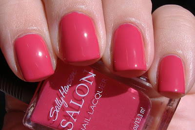
Sally Hansen Azalea:

sally hansen azalea salon nail polish

Azalea is a gorgeous pink creme. This swatch is two coats. For me, this is definitely a fabulous summer pedicure color.

Sally Hansen Forsythia:

sally hansen forsythia nail polish

Forsythia is a yellow shimmer. This is so pretty! There is something very oddball about this color but I am so in love with it. It reminds me of lemons. This is one of those colors that I want to eat! I don't know how well this color suits my skin tone, but it is so cool that I don't care. I will totally wear this all summer long!

Sally Hansen Nasturtium:

sally hansen salon nasturtium nail polish

Nasturtium is a fabulous orange creme. I have heard this color called coral. I don't think there is anything coral about it personally. It is orange. I don't really think this color suits me but I still think it is really pretty. I'll also say that most oranges are a streaky hot mess to apply but this one applied perfectly, like butter.

Sally Hansen Honeydew:

sally hansen honeydew nail polish

Honeydew is a green/teal shimmer. It is nice to finally see that nail polish companies are recognizing the need for some funkier colors in their seasonal collections. I personally love to wear anything blue or green. So this is right up my alley! This color is 100 times prettier in person than in this picture.

Sally Hansen Night Hydrangea:

sally hansen night hydrangea

Night Hydrangea is another color that is 100 times prettier in person. This is the perfect purple shimmer. I don't mind blackened shades. I actually quite like them. But sometimes you just want a purple that looks purple. This is it! The purple that looks purple in all lighting situations.

Sally Hansen Tassel:

sally hansen salon tassel nail polish

Tassel is a metallic gold. This was the only one of the bunch that required three coats. I love that Tracy threw a metallic in the mix for spring. It is fun and unexpected!

There is one more color in this collection - Beet Stain. I have no idea where it is... It's very similar to OPI Miami Beet and Zoya Moxie.

Did you guys notice my short nails in these pictures? I broke the corner off of my index finger so they got filed down. In the winter it is so hard to keep them in good shape! The air is just so dry. Oh well, they have been growing like weeds lately.

Back to the nail polish banter now. Like I said, application on all of these colors was superb. Tassel was the only three coater of the bunch. The others were perfectly opaque with two coats. My only complaint, if you can even call it that, is about the brushes. There is nothing wrong with them per se, but they are a bit long in my opinion. It is really just a matter of my personal preference. My preference is for a shorter brush. I just find it easier to control the polish with a shorter brush. Other than that, these babies are perfect!

The Tracy Reese for Sally Hansen Spring 2009 collection is set to hit stores late February/early March. Distribution of these special collections is notoriously bad; so keep your eyes WIDE OPEN for them and snatch them up as soon as you see them! They'll be gone before you know it.

Monday, February 9, 2009

Orly Prepster Collection for Spring 2009

This Spring Orly introduces the Prepster Collection, a range of six new shades that put a fashion forward twist on traditional style with modern shades of pink, lavender and khaki brown. Today I have three nail polishes from the collection to share with you. But before I do that, I have to let you in on a little secret about me. I love anything and everything preppy! You might not have guessed that with all of the crazy nail polish that I like to wear. But I love me some Lilly Pulitzer, Kate Spade, Stephen Bonanno, J. Crew, and Vineyard Vines. So it is no surprise that I am all over the newest collection from Orly! Now on to the swatches.

Orly Tennis Anyone?:

orly tennis anyone

Off white, nude creme. Even though this was a three coater, it is a great shade because it is an easier and more flattering way to wear a white polish. This shade is warm and not stark like so many other whites in my collection. Winner! Plus I love to play tennis, so just the name is enough for me.

Orly Polo Princess:

orly polo princess

Bright pastel pink creme. I found the application on this one to be a bit troublesome due to the streakiness factor but I like the color enough to make up for it. This is a three to four coater. This is one of those colors that looks good enough to eat. Do you know what I mean? It reminds me of ice cream.

Orly Cashmere Cardigan:

orly cashmere cardigan

Iris blue creme. Loving the name on this one too! The color is fabulous, the picture speaks for itself. 

The other colors in the Orly Prepster collection sound fabulous too:

Prim & Proper - lavender shimmer
OMG - fuchsia pink creme
Country Club Khaki - taupe creme

I wish I had them to share with you but sadly I don't. 

Even though one of these colors was a bit of a pain, overall I am always impressed with nail polishes from Orly. Application is usually top notch. I also love the rubberized gripper cap. Guess who else has a rubberized cap? SpaRitual! Coincidence? I think not. Did you guys know that Orly and SpaRitual are made by the same company? I just figured that one out. No wonder I like Orly.

The Orly Prepster collection is not slated to hit stores until April but I am already hearing stories of these popping up early in beauty supply stores, so keep your eyes open. Plus the etailers have also been known to get collections in early. So hopefully you'll be able to find these soon!

Strengthen your nails with Tamanu Oil. Take a look at Makeup Kits. Available online for all types of
Skin Tones.

Tuesday, February 3, 2009

SpaRitual Cherish Spring 2009 Color Collection

The new SpaRitual collection for Spring 2009, Cherish, features six shades that range from princess pink to baby blue. I have swatches of two of them to show to you today.

SpaRitual Marvel:

sparitual marvel
Lavender pink shimmer. Gorgeous color, fabulous application. I used three coats but you could really get away with two coats just fine. I love this color and look forward to wearing it often. 

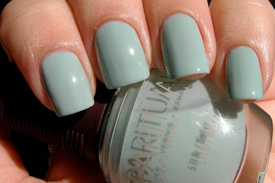
SpaRitual Delight:

sparitual delight
Stunning aqua blue creme. Before you ask, this is not a dupe for China Glaze For Audrey. Delight is a shade or two lighter than For Audrey. 

Oh Delight, you are a delight to look at but not a delight to apply. You see, this swatch isn't three coats of color, it's not even four coats. This swatch is a whopping FIVE , albeit thin, coats of nail polish. This color was just too streaky to look even with less than five coats. I have never encountered a five coater before, this is the first. I am shocked because I have never met a SpaRitual that I didn't like; usually their application is flawless. I don't know if it had something to do with my base coat or if somehow I got a dud of a bottle. Admittedly, I do not own SpaRitual's base coat. But I swatched this over my regular base coat and also a ridge filler. Neither was better than the other. I don't know if using SpaRitual's base coat might have improved the application of this color. I can only hope it would. Sigh... this is still such a pretty color. I don't know if I'll ever have the patience to actually do a manicure wearing it.

There are four other colors in SpaRitual's Cherish Spring 2009 color collection:

SpaRitual Love - bright pink creme
SpaRitual Adore - light pink shimmer
SpaRitual Treasure - bright orange shimmer
SpaRitual Revere - orange and gold shimmer 

I have not seen swatches or even bottle pictures yet of the other four colors but I am very curious to see Revere and Treasure. 

SpaRitual nail lacquers are available in fine salons and spas and online at skinstore.com
These new colors should be available any day now. 


Tuesday, January 27, 2009

Lippmann Collection Spring 2009

These new colors from Lippmann Collection SCREAM Spring to me!

Lippmann Collection PYT: Pretty Young Thing:
lippmann collection pretty young thing
PYT: Pretty Young Thing is a fabulous coral pink jelly. When I saw this in the bottle I was kind feeling "meh" but I really like it on! Application was perfect and I used it over a ridge filler. My nails are a bit yellow and so when I wear sheer nail colors I really like a ridge filler to help cover the yellow. Trust me, sheer jelly pinks and yellow nails do not play well. This swatch is 3 coats of color over the base coat. PYT is opaque with 3 coats over a ridge filler. If you don't use a ridge filling base coat you might need 4 coats. And seriously, PYT by Michael Jackson is one of my favorite songs ever. Such a good party song! Just the idea that this nail polish makes me think of the song is a good thing.

Next, Lippmann Collection Purple Rain:lippmann collection purple rain
Purple rain is a sultry lilac frost. It was designed by Lippmann with the help of designer Zac Posen for use in his Spring 2009 fashion show. When I first saw Purple Rain, I thought it might be dupey for one of the purples in China Glaze's Romantique collection - but it is not. Purple Rain is definitely unique! The formula is a frost and the brush strokes are apparent but they don't bother me one bit. I think they give this nail color a very pretty and soft, almost delicate feel. It is a very feminine color. I usually don't like colors like this but I got so many compliments when I wore it the other day that I just cannot help but like it. 

I am always so excited to see what Lippmann Collection has in store for us so I am a little disappointed that only 2 new colors are being released. Oh well, 2 is better than a big fat zero. I guess we'll just have to take what we can get!

Did you guys know that Lippmann Collection nail polishes contain green tea extracts and protein-building biotin? I did not until doing a little more research on them today. Interesting! I am not aware of any other lines that contain these ingredients. 

These new colors from Lippmann Collection will launch next month online at Lippmann Collection and both online and in-store at Nordstrom.


Tuesday, January 13, 2009

Essie Spring 2009 Collection Swatches

Hi everyone!

Today I have swatches of Essie's Spring 2009 collection for you. First the swatches and then my overall thoughts on this terrific collection. All swatches here are three coats of color, no topcoat. As always, you can click on the pictures to enlarge them if you like.

Essie Lacquered Up:
essie lacquered up
Red Hot Crimson. This reminds me of a juicy, ripe tomato!

Essie Flawless:
essie flawless
Cherry Blossom Pink. Nice opaque pink for those of you that do not like sheer ones. I think this is a very pretty work appropriate type color.

Essie Eternal Optimist:
essie eternal optimist
Spiced tea rose. Nice opaque beige-y nude. Another very nice work appropriate color. This is a color I will definitely reach for when I am in one of my nude color moods, which are happening surprisingly often lately.

Essie Mesmerize:
essie mesmerize
Roa va-va blue. Whoa Essie! This one is straight out of left field! Huge surprise, in a good way.

Essie One of A Kind:
essie one of a kind
Poppy red kiss. Fabulous pedicure color! I love this red hot coral. Nice and bright.

Essie Status Symbol:
essie status symbol
Feisty hot pink. It certainly is feisty! Nice hot pink (not neon) that would also make a lovely pedicure color. I am not huge on pinks but I am really digging this one.

Application on all of these was just fine. I used three coats of nail polish on all of these swatches but to be honest with you, the only one that really needed three coats was Lacquered Up. The rest of them were opaque enough to be fine with two coats.

I am seriously shocked, in a good way, by Mesmerize. This color is so hot! It is mesmerizing, no lie. I have been looking for a fabulous blue creme, one that is not blackened, and this definitely fits the bill. 

As far as the other colors, I can live without Lacquered Up, but I am really digging the rest of them! I think that Essie does the soft colors better than anyone else. Flawless and Eternal Optimist are great soft, work appropriate colors. One of A Kind and Status Symbol are great bright colors. With the exception of Lacquered Up, I would absolutely wear all of these colors in real life. I am actually really excited to get a pedicure with Status Symbol!

I think this collection has a nice variety and something for everyone. Two thumbs up from me for Essie on this collection! What do you all think?

Essie's spring collection will be available starting in February at www.essie.com as well as beauty stores nationwide. 

That is all for now. I will be back soon with some reader requested comparison swatches and of course, more spring collections!

xoxo,
Katee


Saturday, January 10, 2009

Zoya Twist Collection Spring 2009 Swatches

Hello, dear readers!

Today I have for you my swatches of the Zoya Twist collection for Spring 2009. These are so pretty! As always, click my pics to enlarge them. Enjoy!

Zoya Cassi:
Peachy pink with awesome shimmer. For some reason this reminds me of sherbert! I don't know why, but it looks good enough to eat. Call me crazy. The shimmer in this is totally insane, it is like Zoya chopped up little golden diamonds and put them in the polish. Amazing! You could definitely get away with two coats of this nail color but I used three because I was really digging it.

Zoya Malia:

Gorgeous lavender creme. This applied super smooth like butter. Actually, all of these did. This swatch is two coats. I am a habitual three coater but there was absolutely no need for a third coat, that would have been wasteful. 

Zoya Barbie:
zoya barbie swatch
Cutsey pink with magenta shimmer. For me, this is a perfect summer pedicure color. When you enlarge the picture you can see the shimmer much better.

Zoya Harley:
zoya harley swatch
Flawless shimmering grey. I knew I would be in love with this one from the second I saw the promo pics. Oh Harley, where have you been all my life?

Zoya Moxie:
zoya moxie swatch
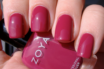
Vibrant red plum creme. This is one that I was not excited about when I saw the promo pics but as soon as I put it on I was in love. What was I thinking? This color rocks!

Zoya Jo:

zoya jo swatch
Fabulous shimmering blue that falls somewhere between cornflower and periwinkle. Funny thing about this color, I love blue nail polish and my boyfriend hates blue nail polish. But when he saw me wearing this one, he actually liked it. Not that I really care what he thinks, I wear what I want! Thank you Zoya for putting a blue in your Spring collection!

Overall, I have nothing but compliments for Zoya on this collection. Flawless application? Check. Fabulous, vibrant colors? Check. Pause from typical Spring colors? Double check. I don't know what else to say. The colors speak for themselves. 


Also, don't forget about the awesome nail polish exchange that Zoya has going on right now. In a nutshell, you send Zoya your old, crappy polishes (non Zoya polishes of course) and then they send you brand new the brand new Zoya polishes of your choice in return. All you have to pay is $3 per bottle processing plus your end of the shipping to send them your old stuff. But basically this offer amounts to a 50% discount, which rocks. I believe there is a 6 bottle minimum and 200 bottle maximum limit. Thanks again Zoya for a fabulous offer. Check out full details on their program at www.zoya.com/exchange.

Ok guys, I mean gals, let me know what you are getting! Guys reading, if you are out there, you can let me know what you want too :)

That is all for today!

xoxo,
Katee

Friday, January 9, 2009

OPI South Beach Collection Spring/Summer 2009 - Swatches Part 2

Hello, dear readers!

Today I am bringing you part two of my OPI South Beach Collection swatches for Spring/Summer 2009. The more I use and play with these nail polishes, the more I love them!

OPI Done Out In Deco:

Gorgeous lilac creme. Need I say more? Ok, I will. This color is fabulous.

Paint My Moji-Toes Red:

Rosy red creme. Not my thing, but there is nothing wrong with this color either. This is one of those colors that falls into the category of something that my mom, sister and best friend would love. 

OPI Clubbing Til Sunrise:

Frosty orange with golden shimmer. I think Clubbing Til Sunrise is the prefect name for this color because when I was swatching it, I definitely thought of the sun. If I have not said this before, I'll say it now - how the heck does OPI come up with these names? I love them! OPI always comes up with the most clever and witty names for their nail polishes. I don't know how they do it.

OPI Suzi & The Lifeguard:

Cool pink shimmer. This is a very girly color! A great opaque pink for those of you that do not like sheer pinks. My sun stopped cooperating during the swatching, so for now, this is not the best swatch of this shade. I will update later when the sun comes out again. 

*edited* The sun came out and so here is an entirely better picture of Suzi & The Lifeguard:

OPI Miami Beet:

Dark raspberry colored creme. I absolutely LOVE this color! My picture does not do it justice. This color is really a few shades darker than this picture suggests. For some reason, colors like this always appear lighter in photographs than they really do in real life. 

OPI Conga-Line Coral:

Rosy orange shimmer. I think this is a shade that my girlfriends with darker skin will be able to rock more successfully than I. But still very pretty!

Ok, so now for my overall thoughts on this collection. I'll be the first to admit, when I saw the promo pics for this collection, I was feeling let down and underwhelmed. But now that I have had a chance to swatch all of the colors, I think this collection has something for everyone.  For lovers of pinks, purples, and summer brights, this collection does not disappoint. OPI also threw in a few colors that are different enough to satisfy those with tastes that fall outside of the mainstream. I know that some of you are disappointed with the lack of a green or blue shade, but hey, all collections can't be everything to everyone.  But seriously, the tie in for a blue color in this collection entitled South Beach would have been soooooo perfect! Either a pale art deco blue or something vivid and shimmering like the ocean. Oh well! But even me, with my tastes for "different" colors, I still found plenty (see below) that I feel are MUST HAVES. 

Katee's MUST HAVES from the OPI South Beach Collection, in no particular order:
OPI Sand In My Suit
OPI Done Out In Deco
OPI OPI On Collins Ave 
OPI Overexposed In South Beach
OPI Miami Beet
OPI Feelin' Hot-Hot-Hot!

Those are my MUST HAVES, colors that I will be rockin' this summer on both tips and toes. 

If you missed the first half of my OPI South Beach Collection swatches, make sure to check them out here. This collection hits store shelves February 4, 2009. 

OK, now that you have seen all of the swatches, I want to know what colors you are feeling! I am really curious, so let me know in the comments.

That is all for now. I hope you enjoyed the swatches.

xoxo,
Katee


Thursday, January 8, 2009

OPI South Beach Collection Spring/Summer 2009 - Swatches Part 1

Good day, dear readers! 

Today I have for you the first look (other than promo pics) at OPI's new South Beach Collection for Spring/Summer 2009. I am sharing six of the colors with you today and will share the other six colors in the coming days. The OPI South Beach Collection will be available February 4, 2009. For those of you that love pinks, corals and reds, you will *love* this collection. There are also a few oddballs in this collection, for those of us with different tastes in nail polish. Now, on to the swatches! And as always, you can click on any of the pictures to enlarge them.

OPI Party In My Cabana:

Pink creme that has a slightly muted appearance. I do not usually wear colors like this but I know that mom, sister and best friend would LOVE this one. I expect emails from at least two of them wanting to steal it from me hahaha.

OPI Bronzed To Perfection:

Caramel brown base loaded with gold shimmer that is large enough to be considered a glitter. This color was one of the surprises for me. When I saw the promo pictures of this color, I did not think I would like it. But now that I am wearing it, I know that I'll love it in the summer when I have a tan. I can also see my friends with darker skin than moi being able to successfully rock this color. I think this would look *awesome* on my friend Brittany from Clumps of Mascara. B, what do you think?

OPI Overexposed In South Beach:

Dark magenta purple with violet shimmer. I really like this color a lot! Probably one of my favorites in this collection. I will wear this on both my fingers and toes. Again, I also think this color will look better on me when I have a little more color. *edited to add* This is a distant 2nd cousin to OPI Louvre Me, Louvre Me Not, but not a dupe. LMLMN is more violet purple than Overexposed. Overexposed is more magenta toned. I would definitely suggest owning both if you like colors like this!

OPI Feelin' Hot-Hot-Hot!:

Very pretty bright pink creme. It looks much more vivid and brighter in person. This is very similar to OPI's Elephantastic Pink but is brighter and cooler than EP. Probably not a color that I would wear on my fingers but I will definitely be sporting this as pedicure as soon as it gets warmer outside. 

OPI Sand In My Suit:

Golden beige-y nude base with serious shimmer. I think this shade is just stunning! This is a great go-to nude for the spring.

OPI OPI On Collins Ave:

Bright coral orange creme. This is another HOT shade. It is bold but I think I will be brave enough to sport this on my fingers this summer. Of course, it would rock for a pedicure too, no question about that. This color is so bright, it glows!

Application on all of these was fine, just like all OPI's that I have used. The only ones that required three coats were OPI Party In My Cabana and OPI OPI On Collins Ave. Other than those two, they were all totally opaque with no streaks at two coats. I will share with you my overall thoughts and feelings on this collection when I post the rest of the swatches in the next week or so.

Again, the OPI South Beach Collection will be available February 4, 2009. From what you have seen so far, let me know which colors you will be getting! Tell me in the comments.

That is all for now, dear reader.

xoxo,
Katee 

Wednesday, January 7, 2009

CND Spring/Summer 2009 Nail Polish News and Swatches

Good day, dear readers!

The new year is officially in full swing and so are the 2009 Spring nail polish collections! The first one I have to share with you is from Creative Nail Design aka CND.

CND is currently in the process of a major color relaunch. They have paired down their current nail color offerings to their top 40 polishes and will begin to create seasonal color collections outside of their top 40 colors starting spring 2010. In the meantime, CND will select colors from their core collection that they feel best represent the seasonal trends from Fashion Week.

For Spring/Summer 2009, CND has selected the following shades:

CND Bisou De Lulu:

CND Bisou De Lulu is a sheer white that is build-able to almost opaque. This swatch is three coats, two coats was a little too sheer for me. This is one of the few whites that is not a streaky mess to apply. When my nails were longer I would never wear colors like this because I thought they made my nails look like acrylics. Now with shorter nails, I think a white nail color like this looks very chic and gorgeous for spring. My boyfriend rarely notices or comments on my nail polish, unless it is a green or something else he hates. But he really liked Bisou De Lulu.

CND Moonlight & Roses:

CND Moonlight & Roses is a sheer color that has a white base and tons of pink and violet toned iridescent shimmer. This swatch is two coats. This is a very pretty color, I think I'll try this one on my toes for my next pedicure.

CND Fedora:

CND Fedora is a gorgeous, red toned brown creme. Inside it looks like dark coffee and outdoors in the sun it almost has a bit of a plum tone to it. If your collection is missing a nice dark brown, pick this one up! 

CND Cocoa:

CND's Cocoa was seen on the runway at spring 09 shows for Giambattista Valli, Nina Ricci, Max Azria, Halston, Thakoon, & Peter Som... to list a few. This is a super chic, fleshy nude creme. This was the #1 requested nail color requested at fashion week by designers. 

CND Wildfire:

CND's Wildfire, a red-violet, raged on both tips and toes at Tibi's spring 09 show. Red is one of those nail polish colors that is very difficult to photograph. This picture does not do this gorgeous red justice. This is a super blue toned red, it is SO HOT in person! I do not normally wear reds, but this color is so sexy, I'll definitely wear it as a mani soon. If you are a red lover, Wildfire is a must.

CND Iced Cappuccino:

CND Iced Cappuccino is a light brown metallic. It is a very pretty color but I am not big into metallic polishes. Application was flawless though, no brush stroke issues here.

CND Decadence:

CND Decadence is a dark red that I might also classify as a jelly. Again, another photographic problem child. This red is much deeper in person. 

Application of all of these polishes was flawless, with a capital F! The lacquer flowed onto my nails perfectly. The finish of all of the cremes in this collection was super glossy. These did dry slower than average for me though. At first I used Orly Bonder and Seche Vite when I did a mani with one of these, and it seemed like they would never dry. But then I did another mani with CND's Stickey base coat and CND's Speedey top coat and they dried much faster. So if you don't have luck with your normal base/top coat combo, give CND's a try.

Overall, I am quite pleased with the shades that CND has selected for Spring/Summer 2009. I get tired of seeing the same old boring pinks and pastels. Here we have gorgeous nudes, a vampy brown and two fabulous reds. I think all of these colors are versatile, wearable, and in my opinion, much more chic than easter egg colored polishes (just my opinion!).

CND products are available at Head2Toe Beauty and 8ty8 Beauty - links are under the "where to haul" section of my blog.

That is all for now, dear readers. Stay tuned for more Spring 2009 nail polish swatches coming soon!

xoxo,
Katee

Friday, January 2, 2009

Essie Spring 2009 Color Collection

Hello, dear readers!

Just received word on Essie's Spring 2009 Color Collection:
(CLICK to enlarge these swatches!)

OK, I don't know about you girls, but I am DYING to get my paws on that gorgeous royal blue shade - Mesmerize. 

Direct from the press release:

"The Essie Spring 2009 collection compliments the season’s dreaminess with a mixed palette of soft red, beige and blue, pinky coral, fuchsia and petal rose – each named to inspire the newness and hopefulness of Spring.

“This was a season of classic hues,” says Essie Weingarten, president and founder of Essie Cosmetics, Ltd. “Last Fall’s potent colors gave way to softer, muted tones for Spring. I created this collection to flatter that feeling of Spring and gave each shade a feel-good name.”

Again, I am absolutely drooling over Essie Mesmerize. I am glad to see that both Essie and Zoya are releasing blues as part of their Spring 2009 collections.
I also like the looks of Eternal Optimist. Looks like a nice peachy color - maybe a nice, less expensive option for Chanel Django? 

These colors will be available in February.

That is all for now...

xoxo,
Katee


Thursday, January 1, 2009

Zoya Spring 2009 Twist Collection

Good morning, dear readers!

HAPPY NEW YEAR!!

I know that I said that I would not be posting normally until January 5th, but this is just a quickie drive by posting.

I was just at Zoya's website and I noticed that you can pre-order their Spring 2009 collection set to ship January 5th. 
I am actually excited by all of these nail colors except for Barbie and Moxie, but I am sure I'll end up liking them too. I bought the sampler collection of all 6 nail polishes ($36) and also a huge bottle of Remove, the best nail polish remover ever. That is all for now.

xoxo,
Katee

Tuesday, December 23, 2008

NOTD: CHANEL Vendetta

Hello everyone!

I think this might be might last post of 2008, so I wanted to go out with a bang! I have mucho mega packing to do tomorrow and then we fly home to Michigan on Christmas day. We have a wonderful 6:30 a.m. flight that I am really looking forward to *wink*.

Today I am wearing the lovely CHANEL Vendetta, which is new for Spring 2009. Ohhhh I am in love with this one. On to the swatches!

CHANEL Vendetta indoor natural light:
chanel vendetta
CHANEL Vendetta sun:
chanel vendetta
chanel vendetta
chanel vendetta
(click pictures to enlarge, especially the sun ones to see shimmer)

CHANEL Vendetta is very similar to CHANEL Blue Satin in the sense that the shimmer is only visible outside in full on sun. It also has a very similar glossy, satiny and deep finish indoors. I think they should have called it Purple Satin or Violet Satin. The first picture of CHANEL Vendetta indoors is very true to life as far as the color goes, even though the shot is a bit blurry for my standards; it also represents the satiny finish very well. CHANEL Blue Satin has been my favorite nail polish for a long time but I think that CHANEL Vendetta *might* take the top spot from it. Maybe a tie. CHANEL Blue Satin is the only nail polish that I have ever bought a backup of. CHANEL Vendetta might be next.

Well, since this might be the last time that I am here in between now and the new year, I just wanted to take a moment to thank all of you loyal readers. All of your comments and e-mails really add to to my enjoyment of blogging! I hope that all of you have a wonderful Christmas!

xoxo,
Katee

p.s. I apologize for the obnoxious watermark, I tried to make it as unobtrusive as possible. I am just sick of my pictures turning up everywhere on the Internet, being copied without my permission. Someone even had the nerve to post my pics to their Flickr photostream!! Now at least if people copy my pictures they will look like jerks, since they say "DO NOT COPY".